Talltales
Disciplines
Naming + Strategy + Brand + Print + Digital
Partners
Lighten (Digital)
Tall tales for small kids...
The owner of Book4us and the Early Starts nursery chain approached me for a rebrand and a new website. After an initial audit of their current brand and website, we identified that they only sell books for children 14 and under.
Several rounds of research and market analysis presented an opportunity to fill a gap in the market for a children’s-focused online book retailer. This insight led us to start from scratch.
We embarked on a rigorous naming process, presenting over 50 names and 10 accompanying visual identities. Ultimately, we settled on "Talltales," a simple yet fun homophone that cleverly plays on the words "tail" and "tale." This idea paved the way for a visual identity that playfully misleads the eye and encourages imagination.
The visual style is bold, flat, and playful, featuring a series of characters each with their own "tall tales" to tell. We only see their tails, leaving the rest to the imagination, akin to how readers bring stories to life in their minds.
The color palette is bright and fun, inspired by characters we all know and love, designed to captivate and engage young readers. The typography has a nostalgic yet modern feel, ensuring readability while maintaining a playful tone that also appeals to parents.
The inception and branding exercise of Book4Us led us to a whole new brand... Talltales, which not only filled a market gap but also created a dynamic and engaging platform for children’s literature. The playful name, coupled with a vibrant visual identity and imaginative illustration style, positions Talltales as a unique and appealing place for parent toto discover and explore litterature for their little readers.


W_RKSPACE
Disciplines
Strategy + Brand + Print + Signage + Digital
Partners
FromDayOne (Advertising)
Lustalux (Signage)
Lighten (Digital)
Creating Space for Work
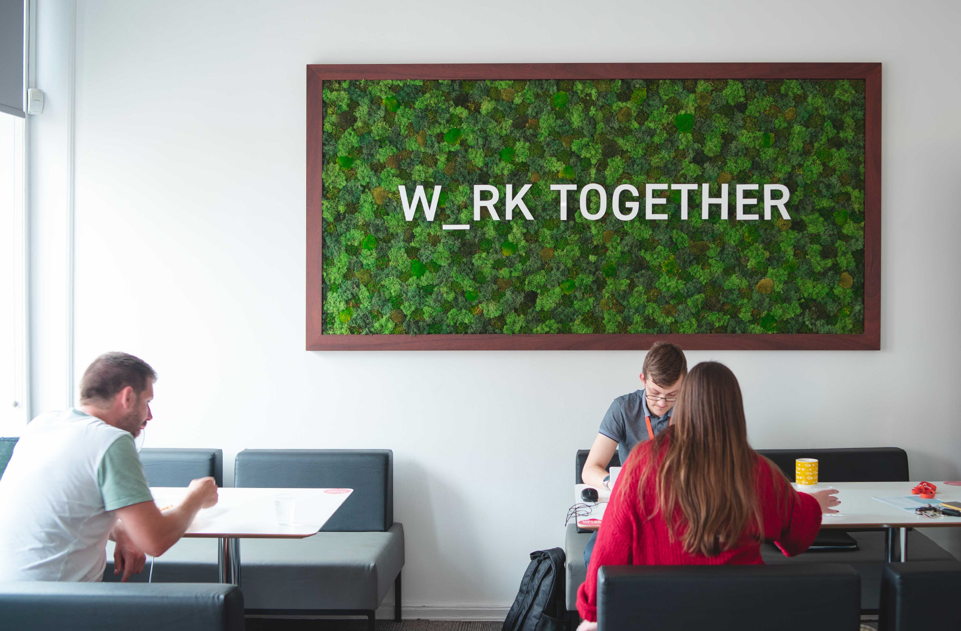
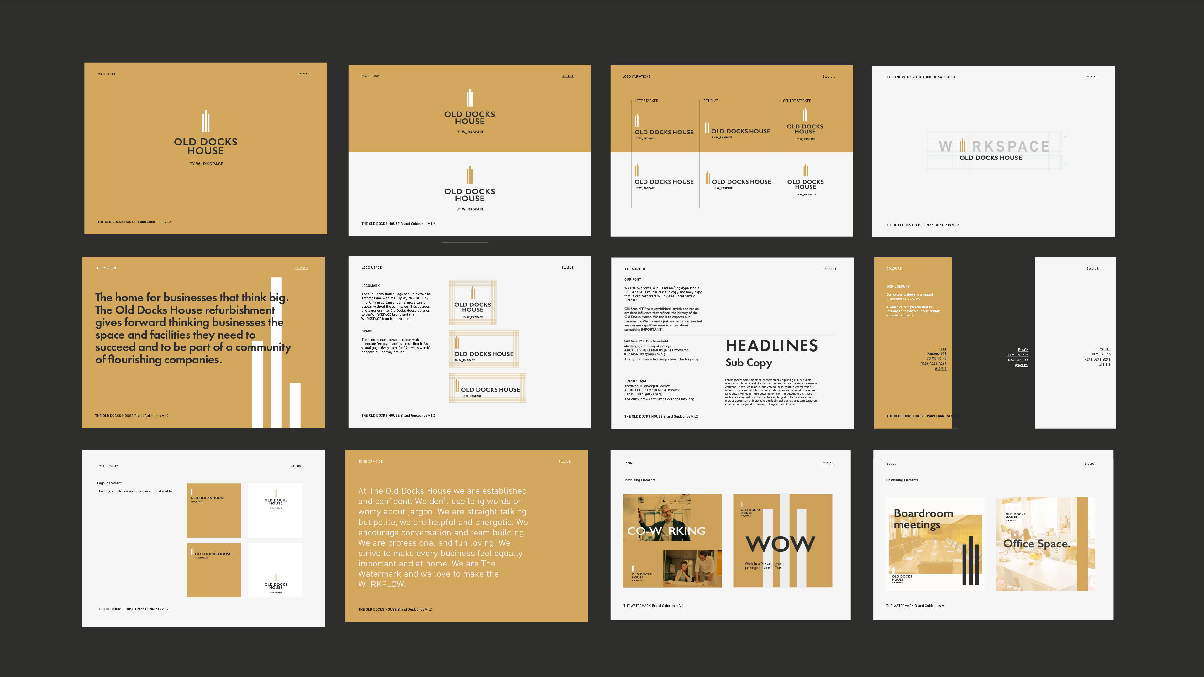
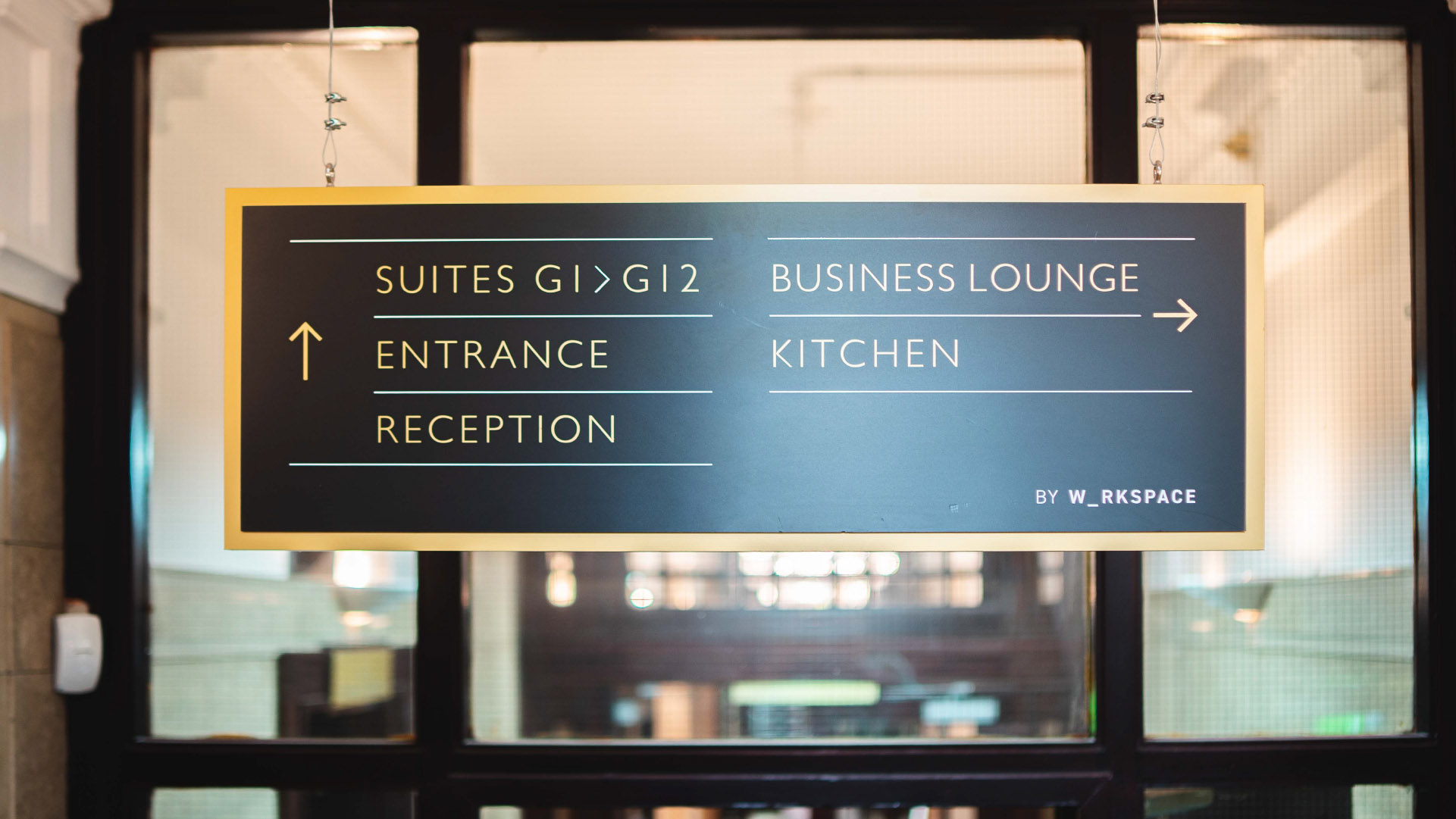
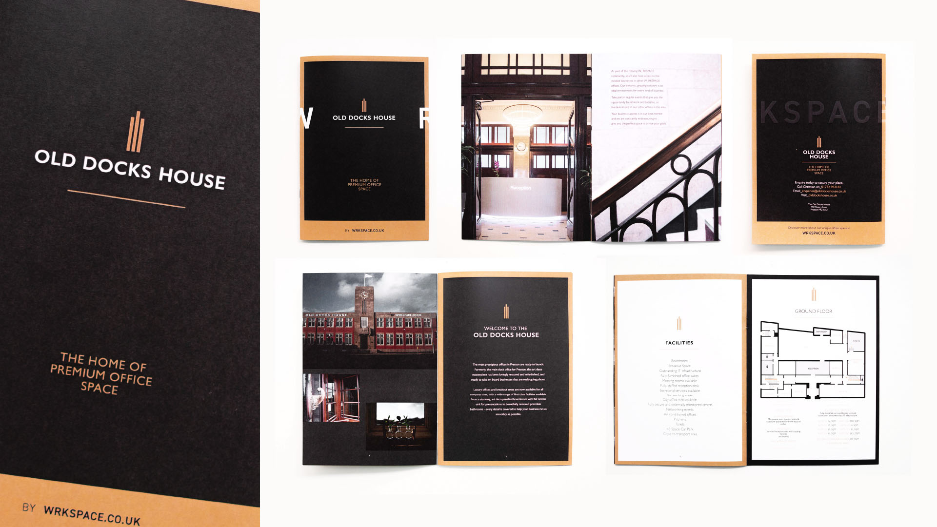
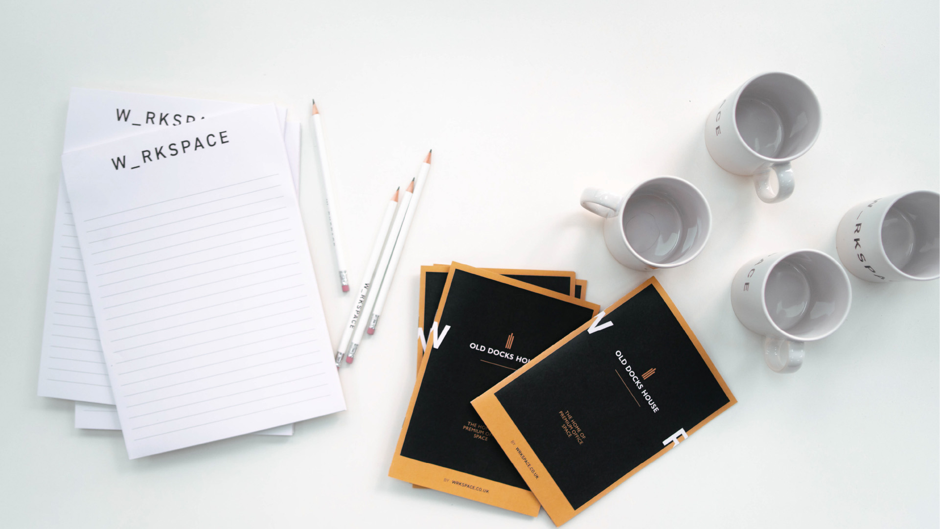
Mayfair Business Centres approached us with an open mind to reposition their brand to stand out in a saturated market place.
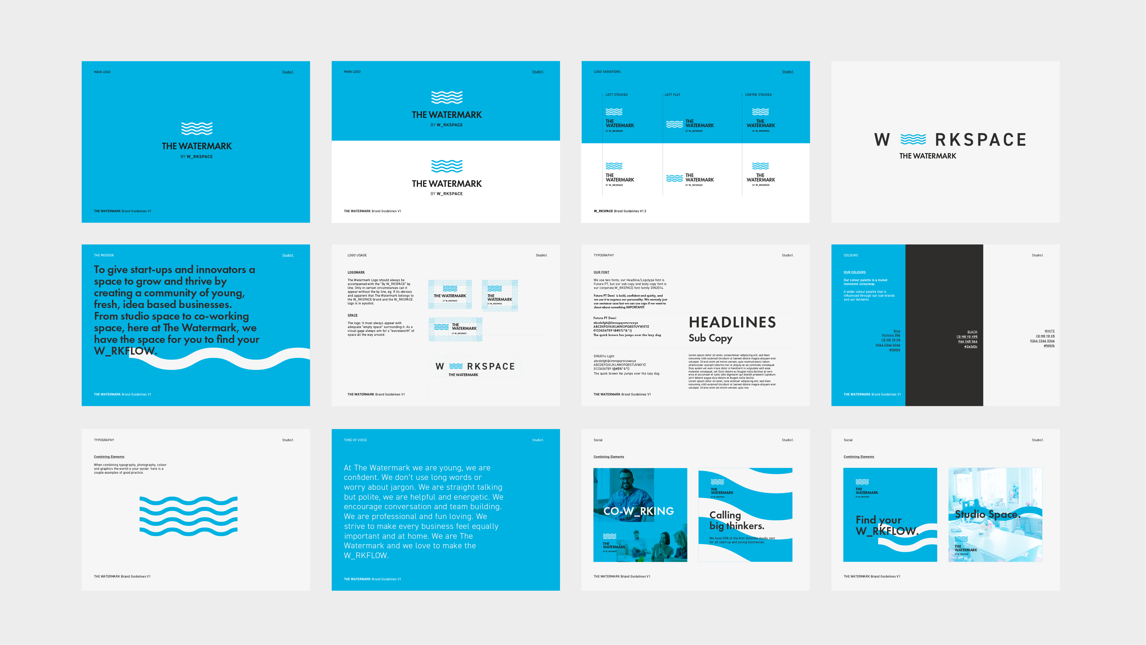
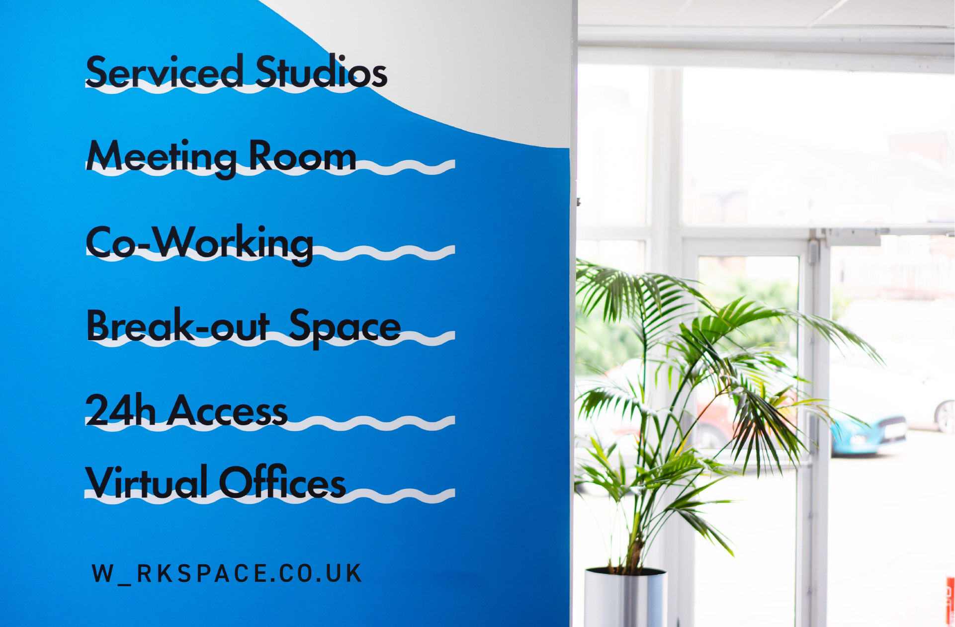
The strategy is underpinned by the simple fact that Mayfair offer spaces of all shapes and sizes as blank canvasses for their customers.
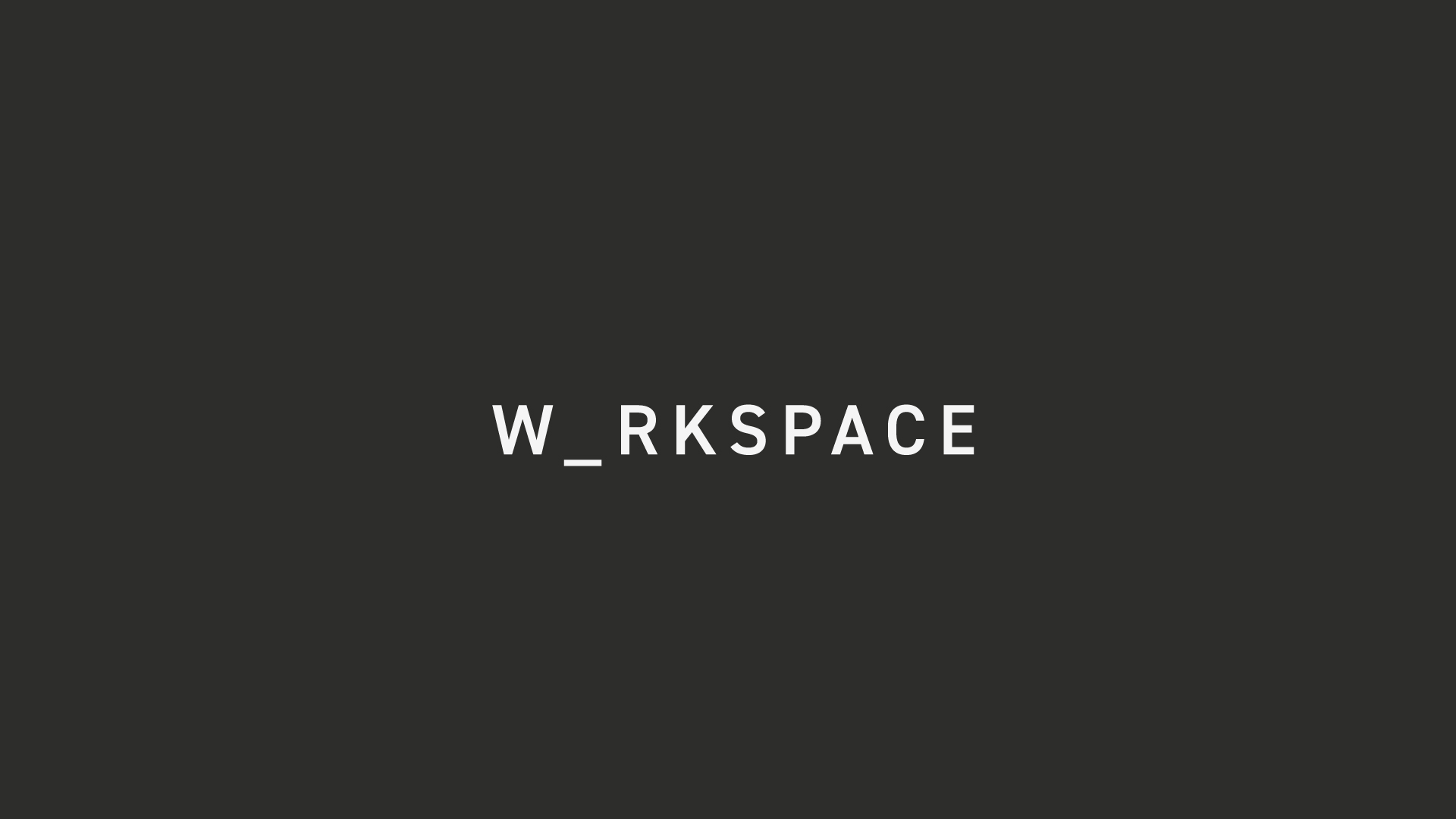
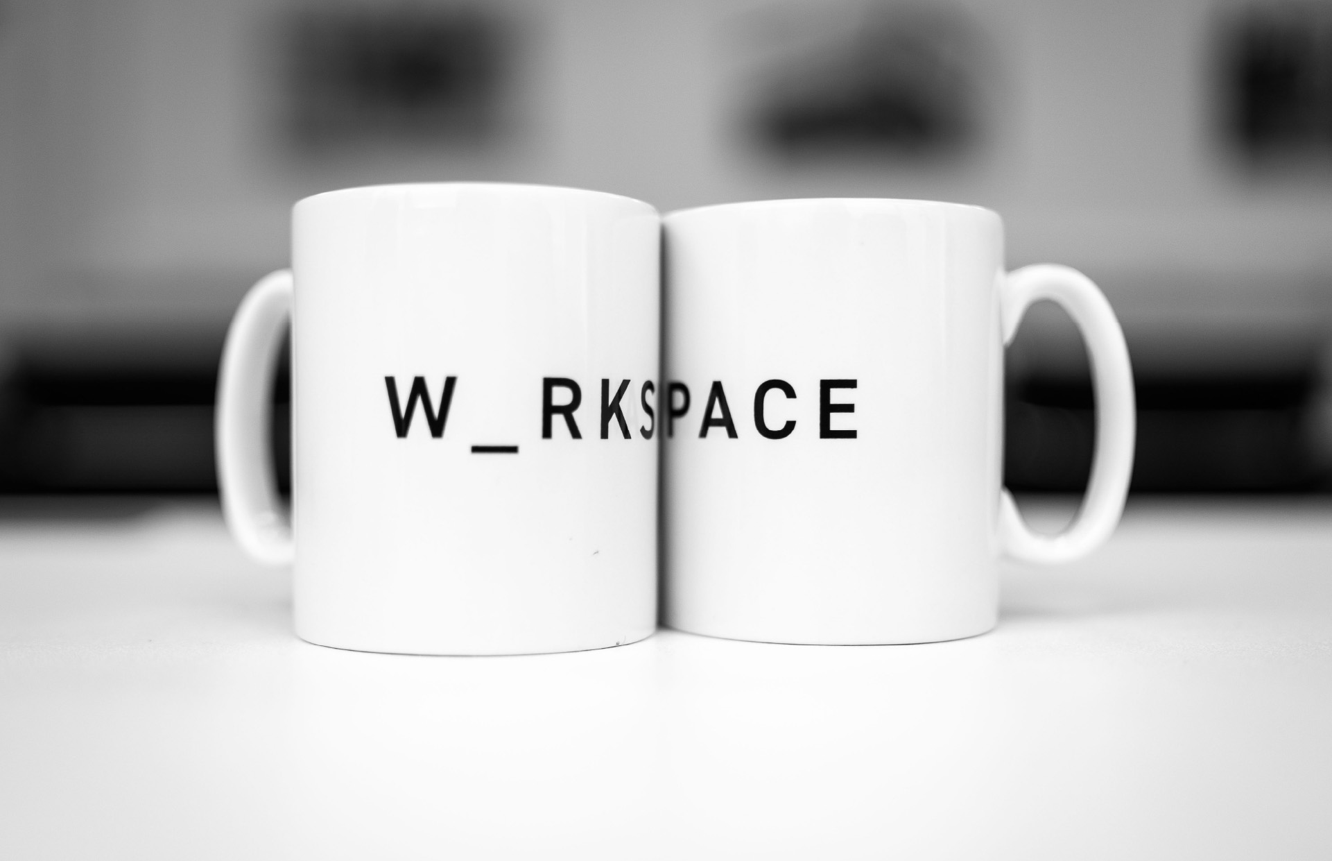
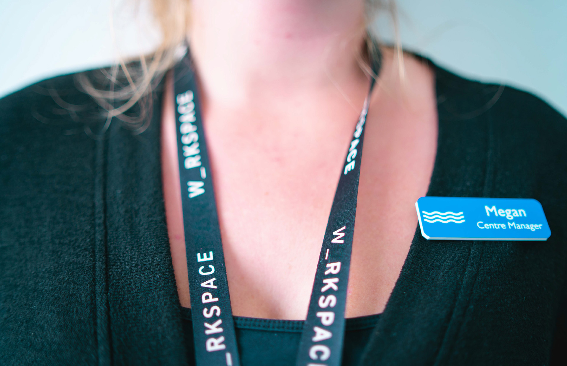
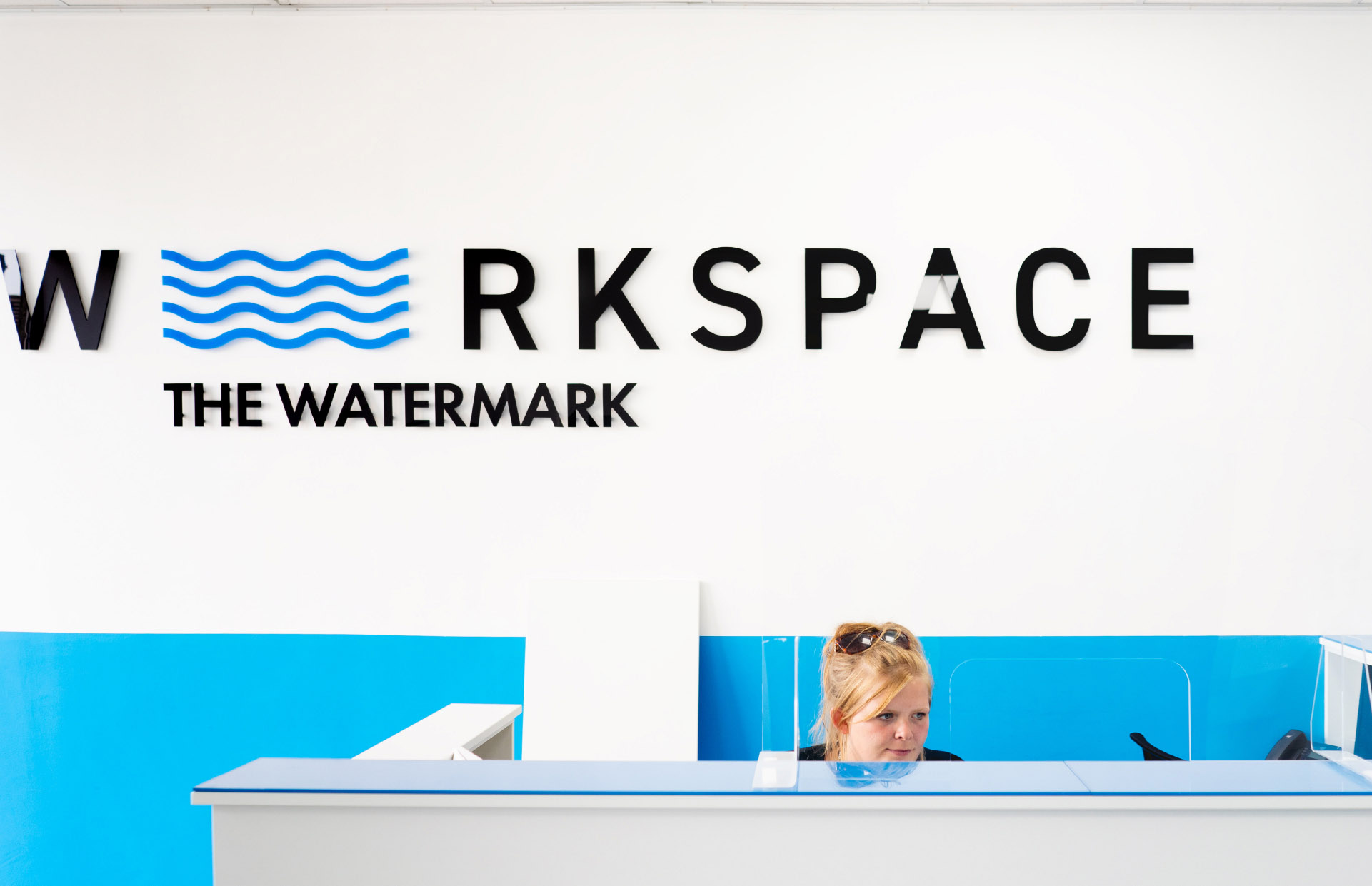
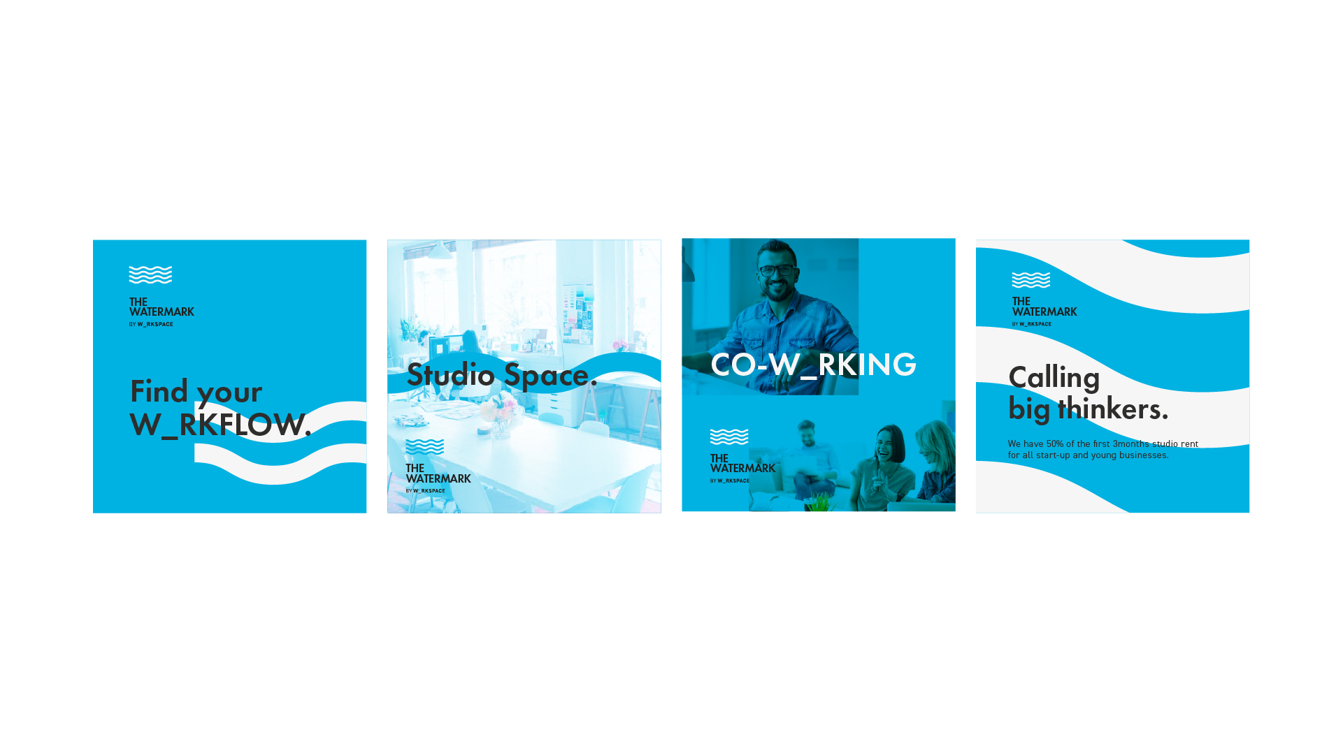
Mayfair provide the space, the infastructure, the amenities and you make it your own. We developed a brand that creates a space to be filled. A brand that has the ability to give each centre its own personal voice, to appeal to certain styles of businesses. Goodbye personality vacuums… Hello W_RKSPACE.







Disciplines
Strategy + Brand + Print + Digital
Partners
Nick Elsby (Animation)
Whisk Yourself Away
Working closely with the team behind Preston’s most successful cultural venue, we were asked to create a brand that reflected the vibrant and eclectic nature of the audience and events.
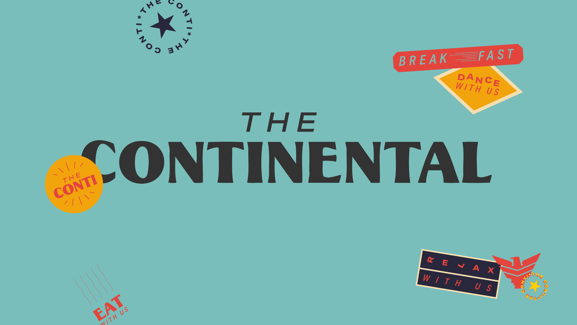
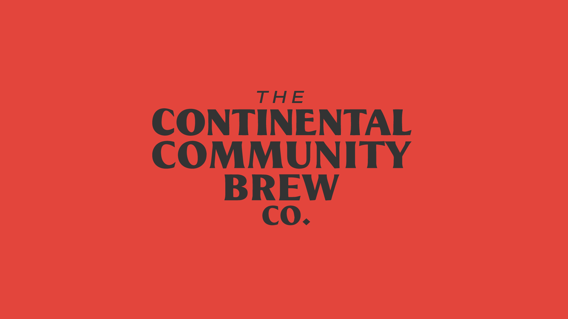
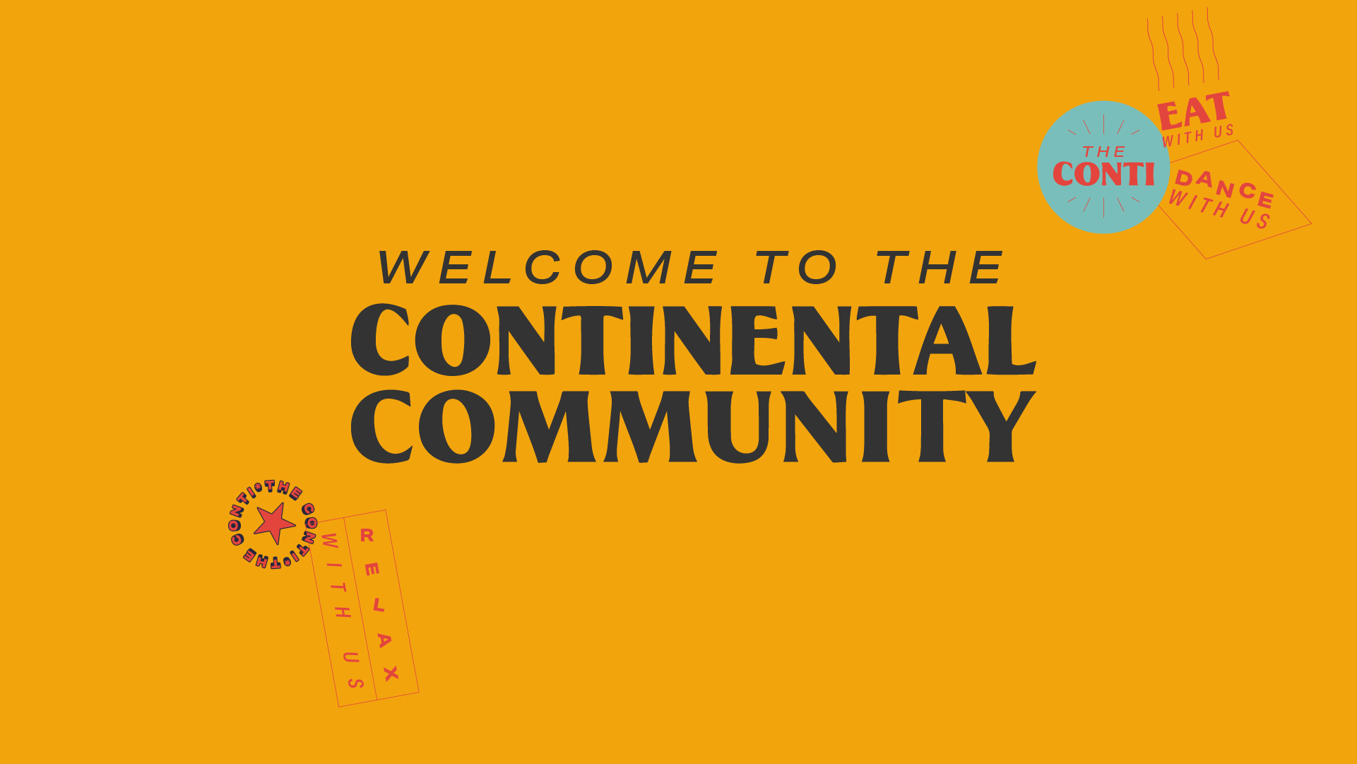
In the midst of the Uk’s European exit we pitched a return to the true meaning of continental. Taking inspiration from the golden years of European travel we developed a brand that has modern vacation vibes with a bucket load of nostalgia.
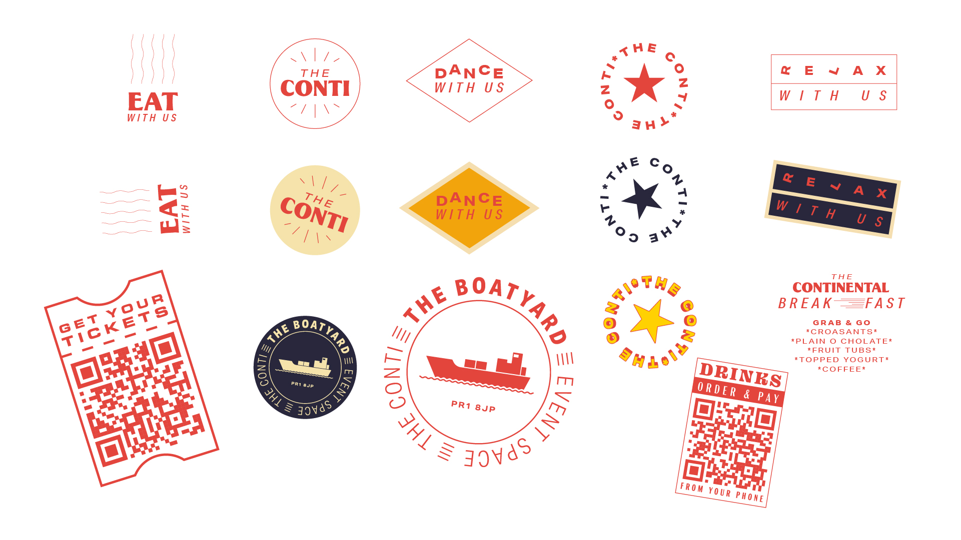
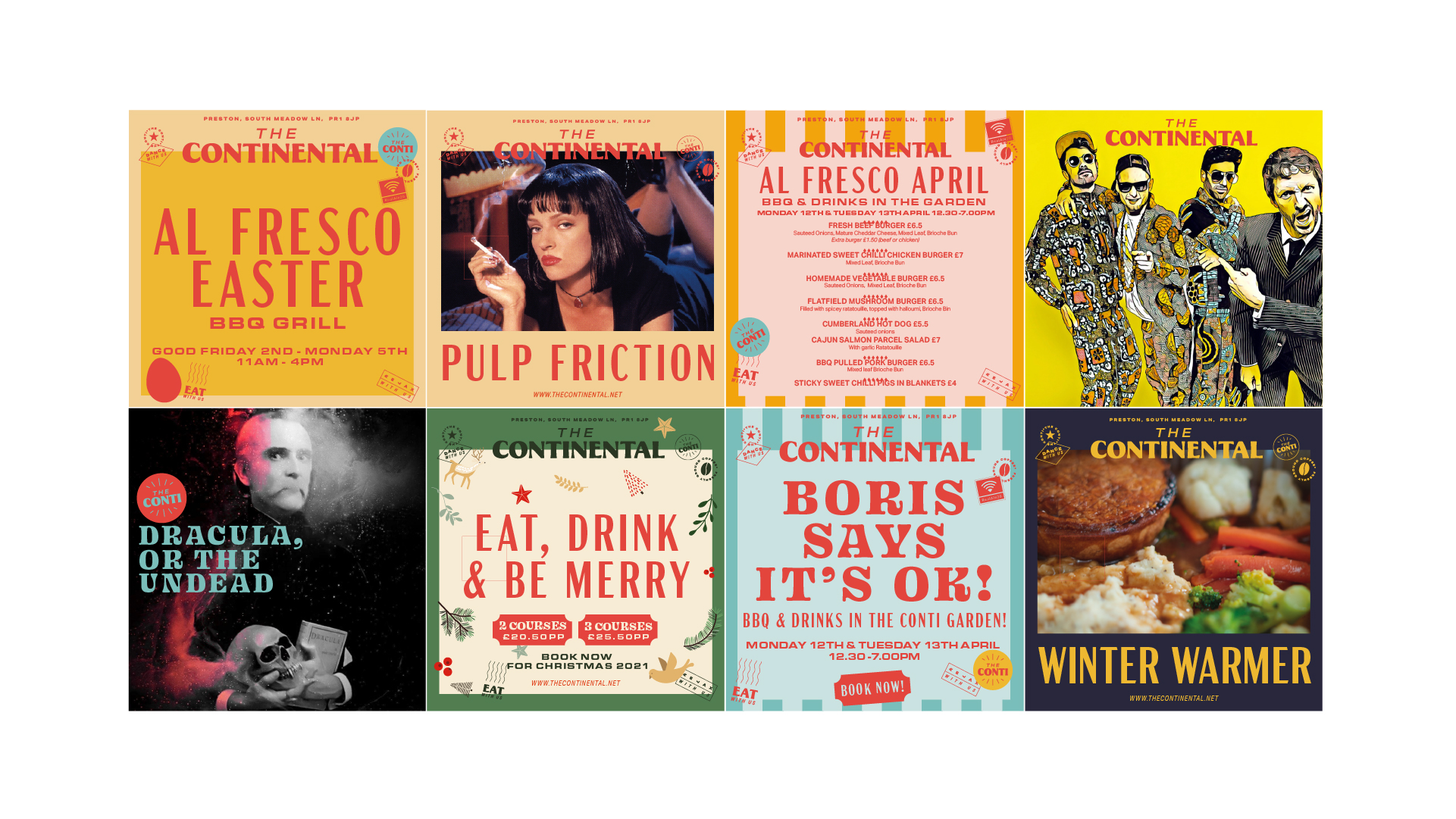
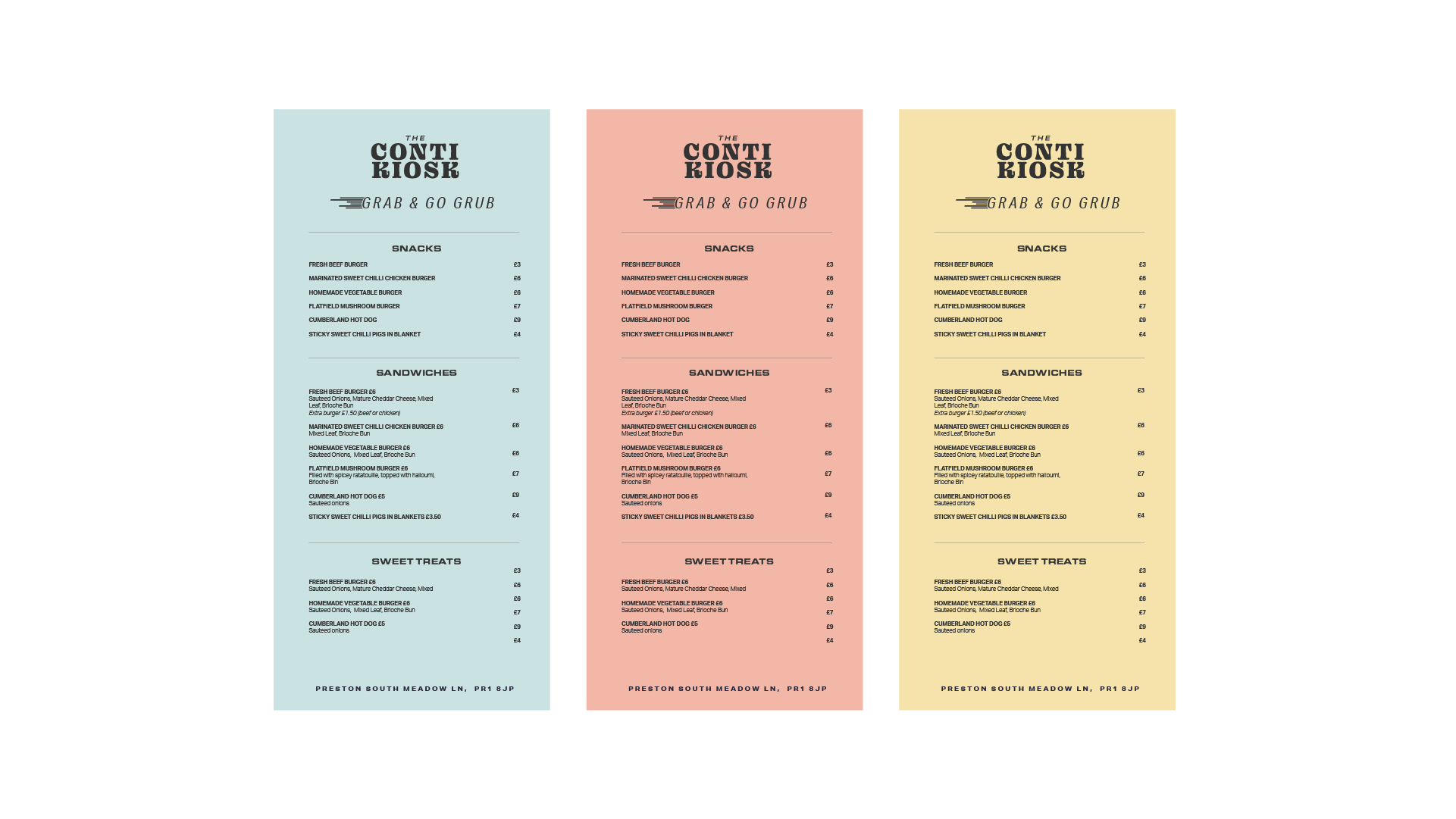
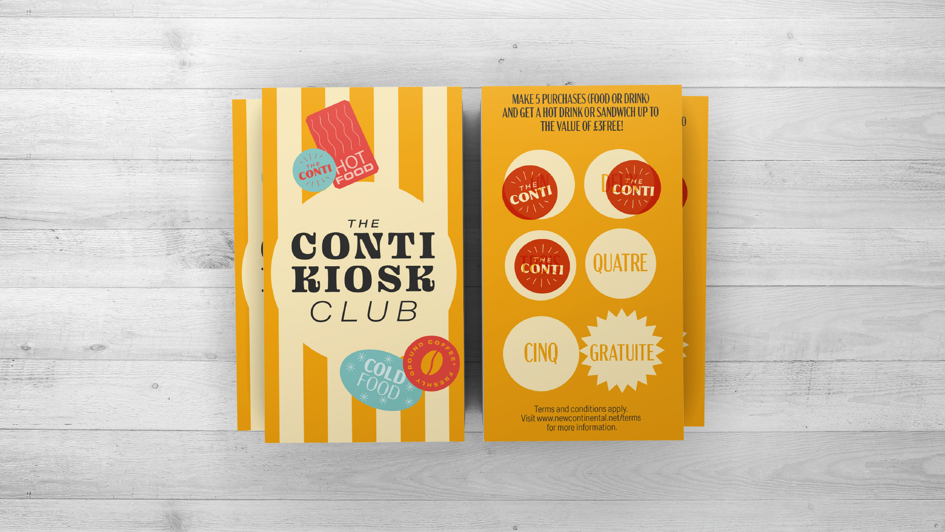
A bold custom word mark became the marquee of the brand, follow by a combination of six headline fonts that enable the brand speak clearly to different audiences. Combined with lively, bold colours and a “travel inspired” stamp system that adds a quirky edge on unexpected touchpoints. The menu system is informal and paper-based with lively, saturated colors and mixed typography to add character and high impact.




Flashback
Disciplines
Concept + Brand + Digital + Animation + Social
Partners
Lighten (Digital)
Alex Zawadzki
Jamie Holman
Coverage
The Guardian
Creative Boom
Prolific North
Raw, unpretentious typography
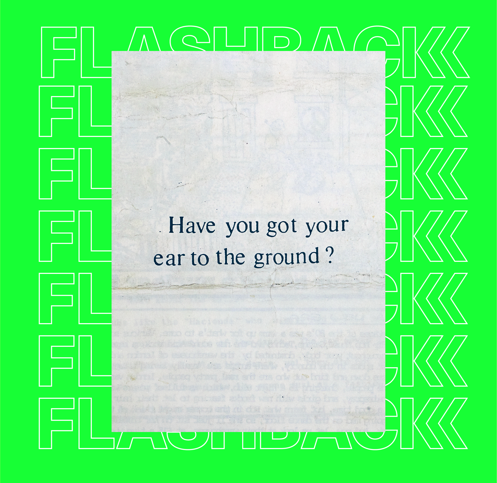
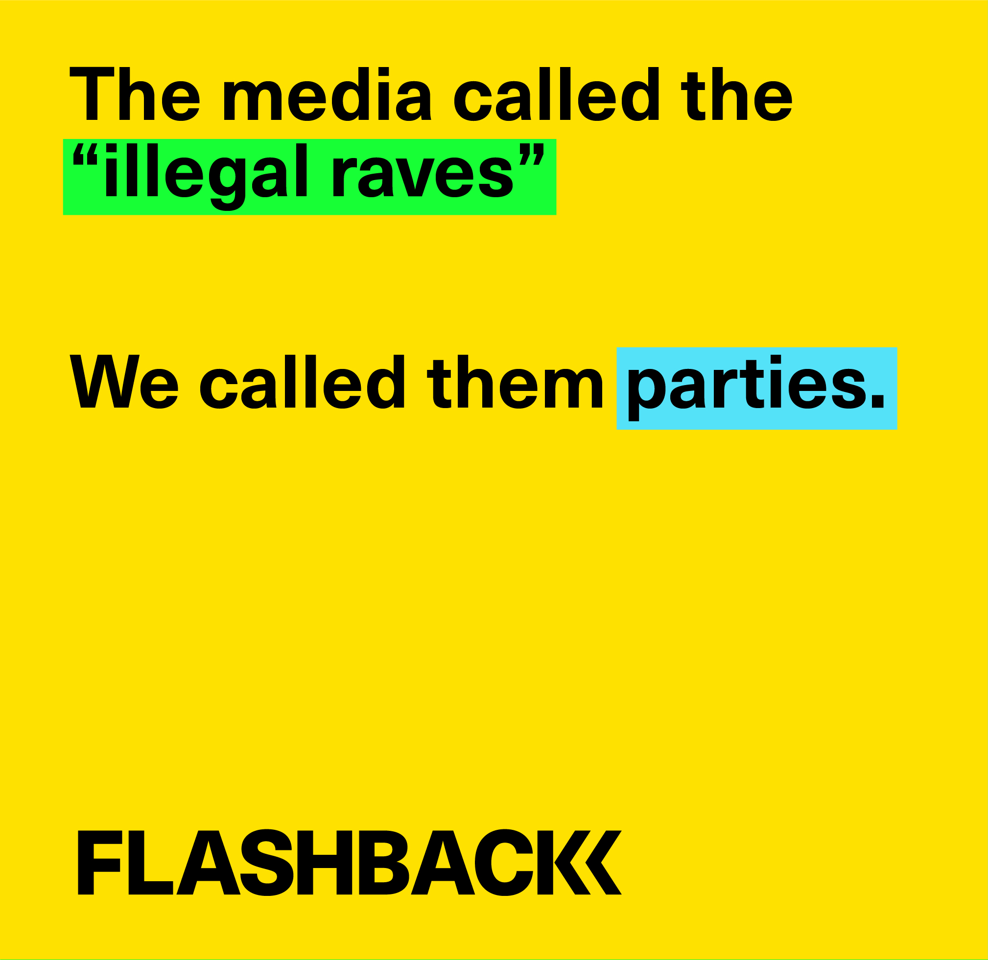
The Flashback archive takes the stories and experiences of the individuals involved in the Blackburn Acid House parties of the past and represents them in a captivating and digitally intuitive way, using new technology to create an immersive online experience.
The brand purposely moves away from the stereotypical smiley faces and neon rainbows associated with the Acid House movement and instead explores the reality of raves as an escape from the day-to-day of Thatcher’s Britain. It looks and feels functional, not too slick, almost under designed to some extent. This way it’s honest to the subject matter and in keeping with the unpretentious, no-nonsense atmosphere of these gatherings.
With the word-of-mouth nature of these early raves it seemed natural for us to explore a typographic route. We capitalised on the hypnotic nature of subtitles to create a timeless and immersive digital experience.
Visit the website




Alpine Fire Engineers
Disciplines
Strategy + Brand + Print +
Digital + Signage + Interior
Partners
Emma Louise Gibson (Marketing)
Lighten (Digital)
We Are Design Engineers
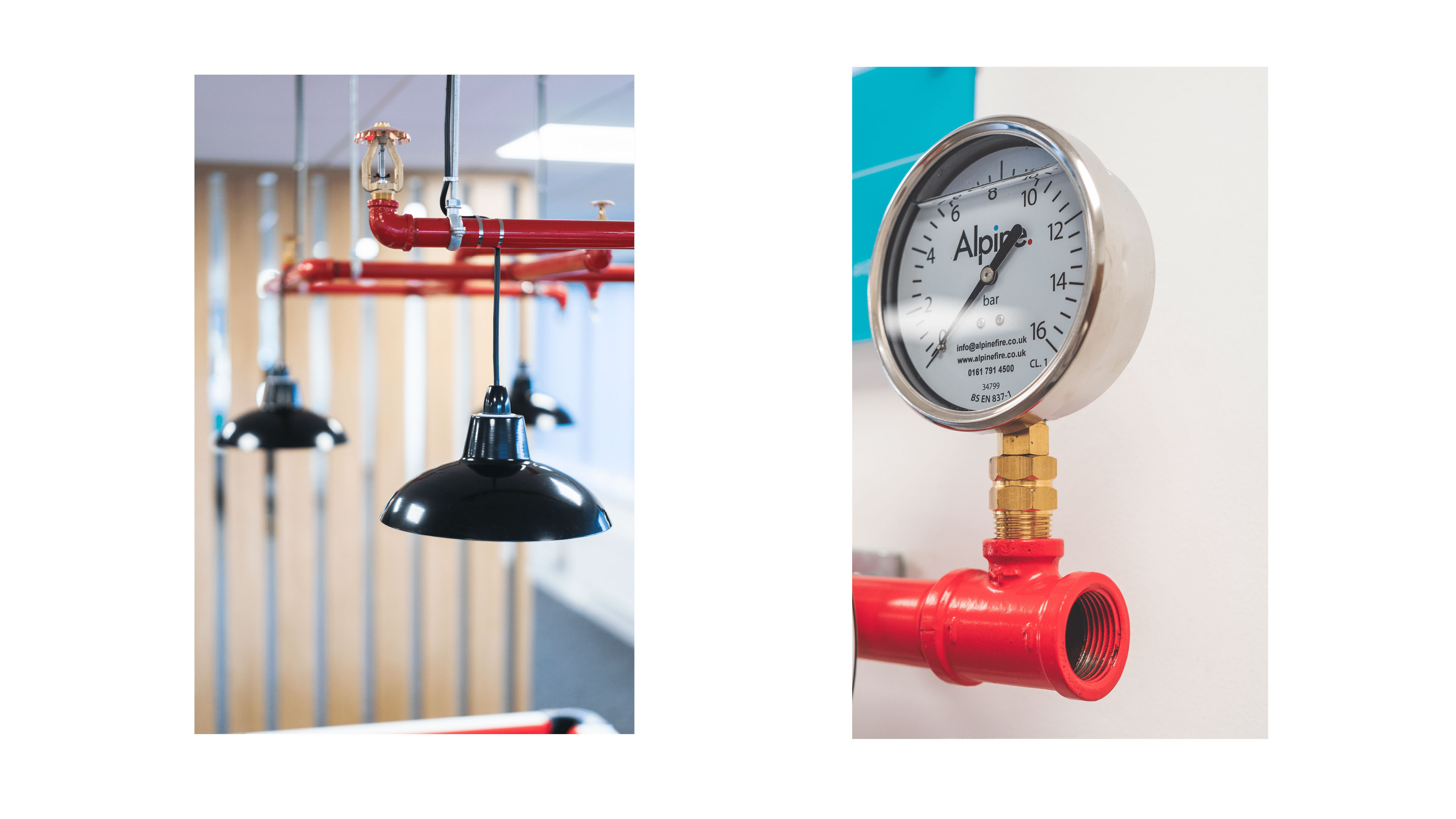
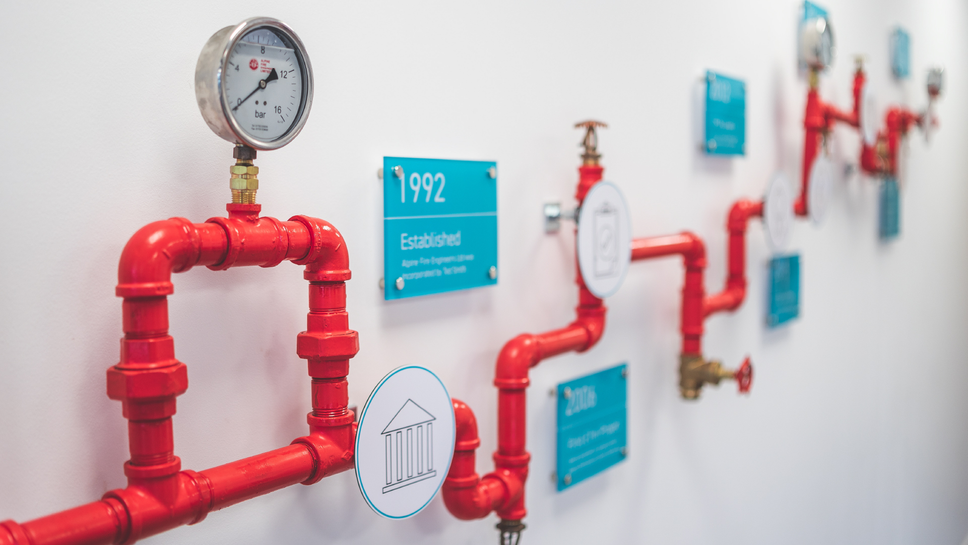
Alpine Fire Engineers approached us as they where growing at an exponential rate. They had made their name through being on the cutting edge of designing complex fire safety systems for huge warehouses.
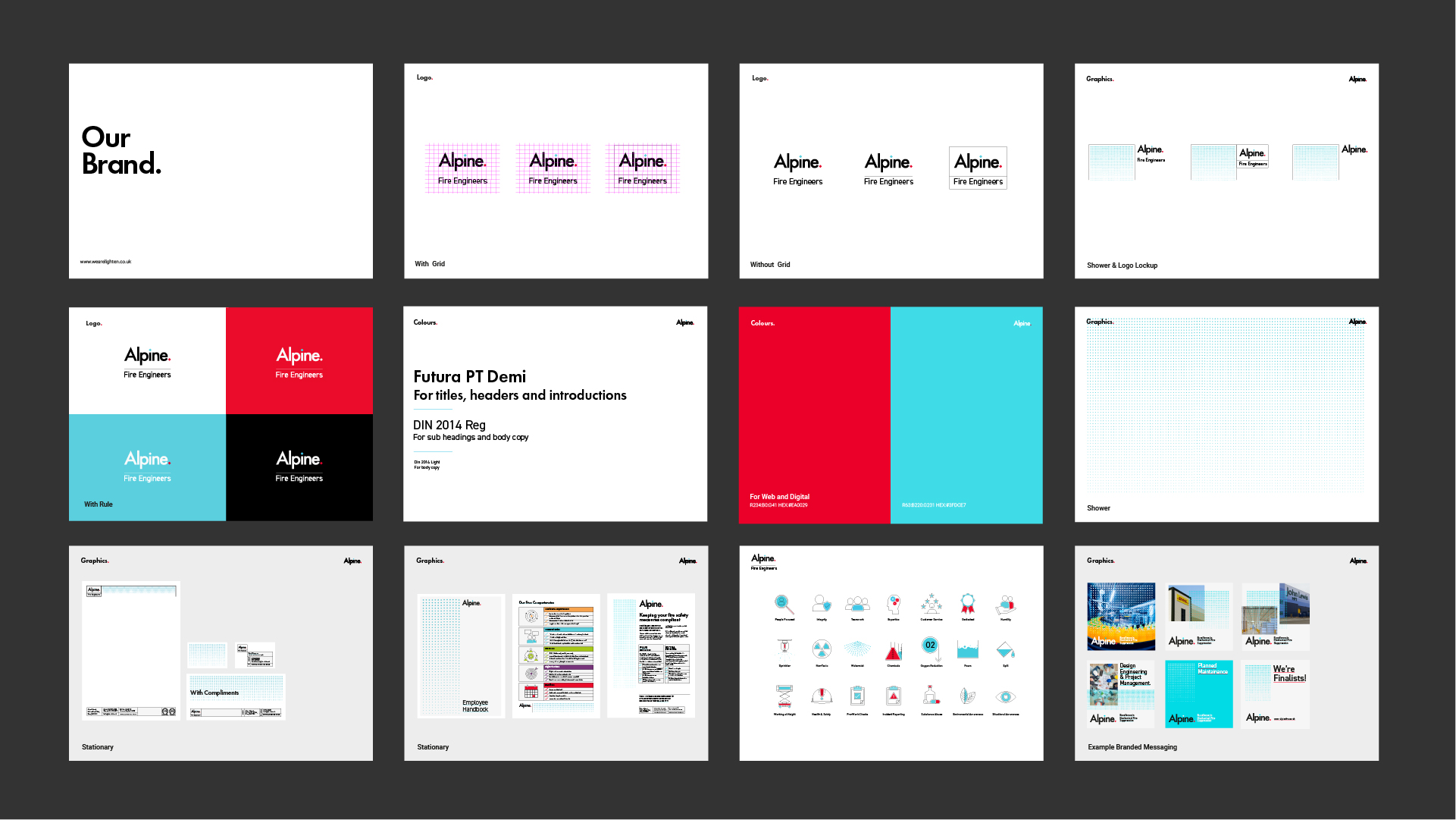
Our aim was to build upon the existing Alpine brand in order to reposition them as thought leaders in their field. We scrapped everything but the colours.
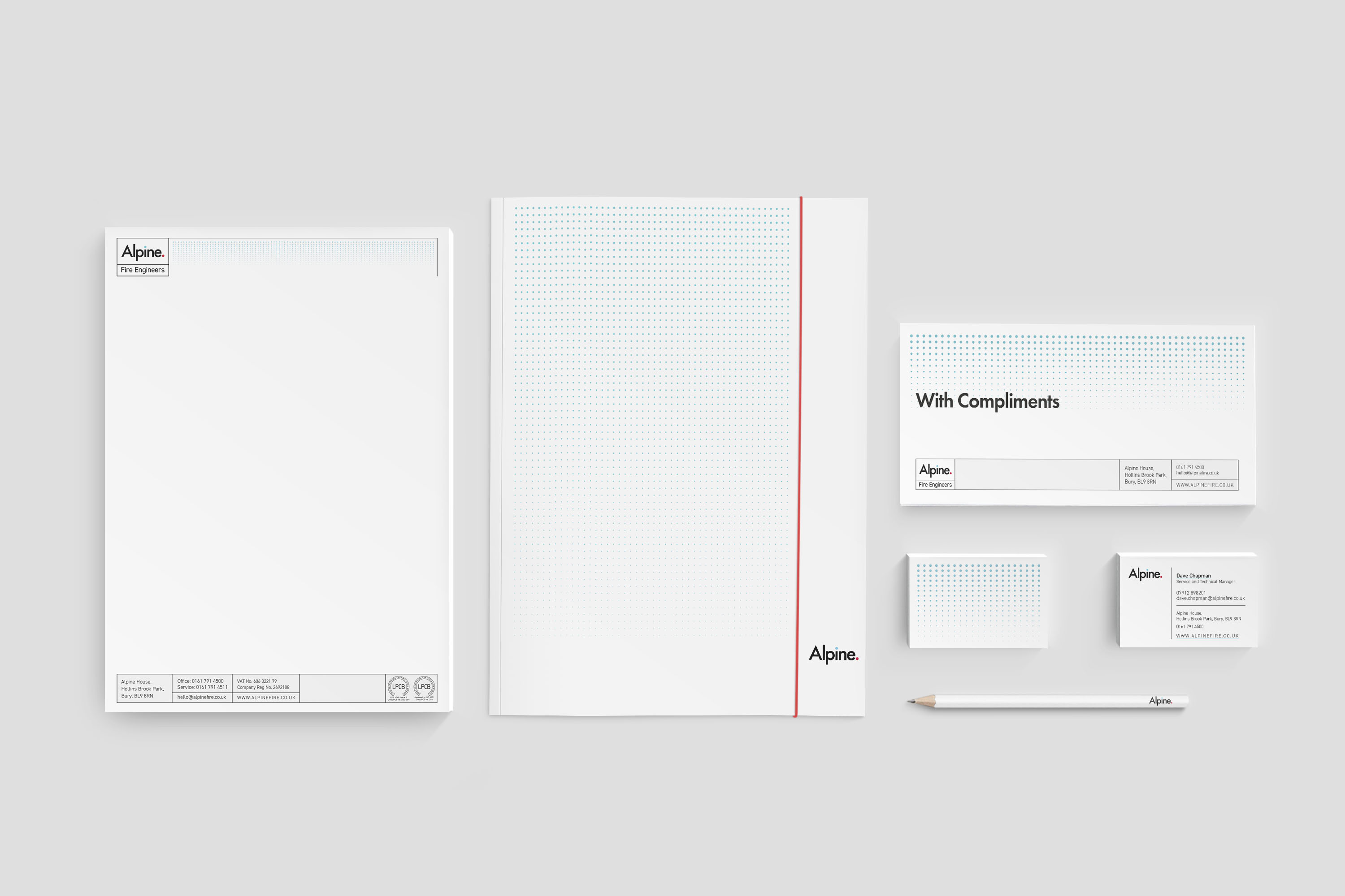
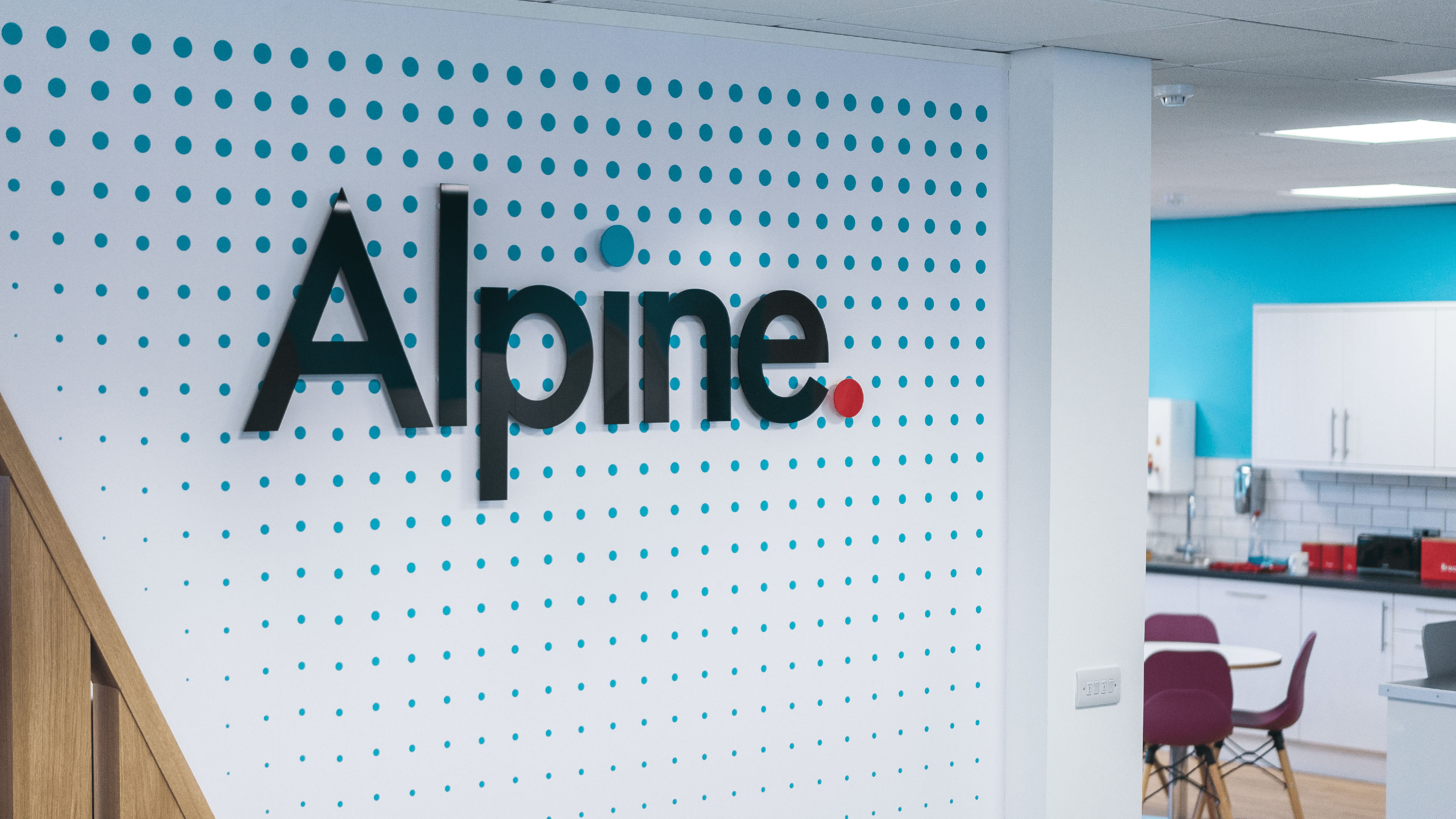
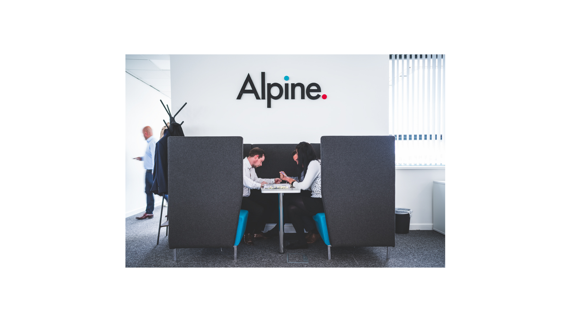
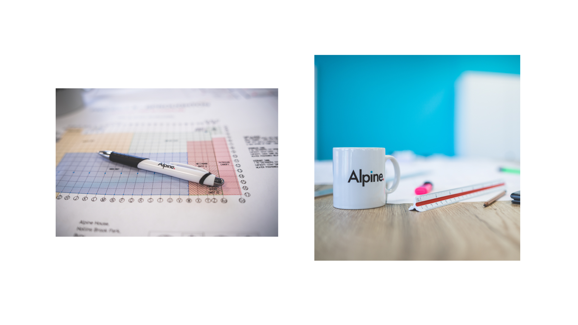
We built a brand language that screams design engineer with simple, bold, timeless typography alongside CAD-like lines and geometric patterns. All this combines to create a sophisticated brand identity that has driven growth and built an internal loyalty that has seen productivity go through the roof.
Visit the website
